> ## Documentation Index
> Fetch the complete documentation index at: https://docs.base44.com/llms.txt
> Use this file to discover all available pages before exploring further.
# Customizing the design of your app
> Customize your Base44 app's look with the Theme panel, Edit mode, and AI chat: colors, fonts, per-element styling, themes, and motion.
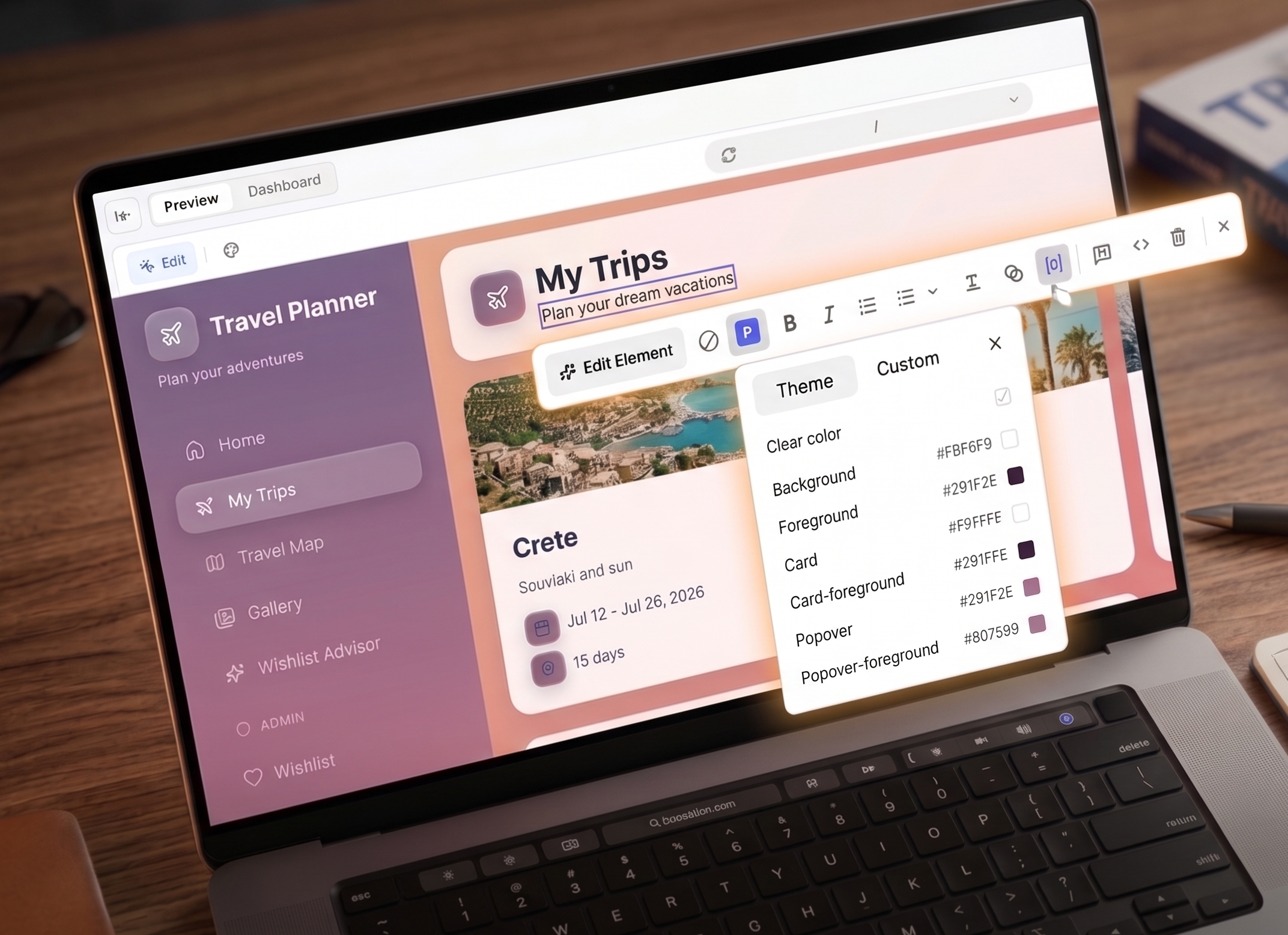
Base44 gives you several ways to design your app: the **Theme** panel for global colors and fonts, **Edit** mode for per-element styling, and AI chat for broader changes. This page covers each approach with prompts and examples you can use directly.
 For building a consistent design system, working with images, responsive layout, and accessibility, see [Design foundations and layout](/Building-your-app/Design-foundations-and-layout).
***
## Working with AI on design
AI is at the center of how you design in Base44. You can just describe what you want in natural language, and AI updates code, styles, and components for you. **Edit** mode lets you tweak what you see on screen, and AI Controls help you set boundaries.
The AI chat is ideal for global changes and design decisions that affect many parts of your app. You can define a persona and brief once, then build on that:
```text theme={null}
You are my product designer for this app.
Design brief:
- Purpose: Help content teams plan, write, and ship articles faster.
- People: Busy content leads and writers on laptops during the workday.
- Feel: Calm, focused, modern, trustworthy.
Use this brief as the basis for all design suggestions and decisions.
```
Helpful patterns:
* Ask for a critique before asking for changes.
* Ask for a plan in Discuss mode, approve it, and then ask AI to implement it.
* Always clarify the scope of the design: the whole app, one page, or one element.
Example:
```text theme={null}
Critique the design of this dashboard only.
Focus on layout, hierarchy, color, typography, and spacing.
Then propose a short plan of small changes.
Wait for my approval before you apply anything.
```
After you review:
```text theme={null}
Apply the plan you proposed for this dashboard.
Make changes in small groups and describe each group briefly as you go.
```
**Edit** mode is ideal when you want to adjust what you see without rewriting everything.
For building a consistent design system, working with images, responsive layout, and accessibility, see [Design foundations and layout](/Building-your-app/Design-foundations-and-layout).
***
## Working with AI on design
AI is at the center of how you design in Base44. You can just describe what you want in natural language, and AI updates code, styles, and components for you. **Edit** mode lets you tweak what you see on screen, and AI Controls help you set boundaries.
The AI chat is ideal for global changes and design decisions that affect many parts of your app. You can define a persona and brief once, then build on that:
```text theme={null}
You are my product designer for this app.
Design brief:
- Purpose: Help content teams plan, write, and ship articles faster.
- People: Busy content leads and writers on laptops during the workday.
- Feel: Calm, focused, modern, trustworthy.
Use this brief as the basis for all design suggestions and decisions.
```
Helpful patterns:
* Ask for a critique before asking for changes.
* Ask for a plan in Discuss mode, approve it, and then ask AI to implement it.
* Always clarify the scope of the design: the whole app, one page, or one element.
Example:
```text theme={null}
Critique the design of this dashboard only.
Focus on layout, hierarchy, color, typography, and spacing.
Then propose a short plan of small changes.
Wait for my approval before you apply anything.
```
After you review:
```text theme={null}
Apply the plan you proposed for this dashboard.
Make changes in small groups and describe each group briefly as you go.
```
**Edit** mode is ideal when you want to adjust what you see without rewriting everything.
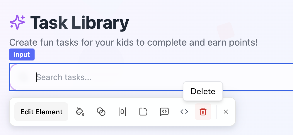
 Click **Edit** in the chat and then select the element you want to change. You can:
* Select a section and adjust colors, spacing, and layout visually.
* Ask AI to restyle just one component instance.
* Delete elements you no longer need using the **Delete** icon .
* Use it as a safe sandbox before you roll a pattern out to the rest of your app.
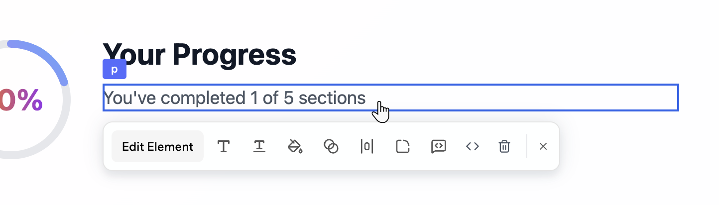
Click **Edit Element** on the Edit toolbar to ask the AI to make changes. For example:
```text theme={null}
In this selected section:
- Lighten the background slightly
- Increase vertical spacing between the heading and content
- Use the primary button style for the main action and secondary style for the others
```
```text theme={null}
For this card only:
- Increase padding
- Move the icon to the left of the title
- Use a softer shadow that matches other cards in the app
```
Use the [AI Controls](/Building-your-app/AI-chat-modes#setting-ai-controls) in the chat to guide and protect your design.
You can:
* Set design guidelines that apply to every prompt.
* Freeze specific files or pages so AI does not change them.
* Establish a tone such as minimal, bold, or playful.
Example guidelines:
```text theme={null}
Global design guidelines:
- Prefer calm, minimal visuals with plenty of white space
- Use rounded corners with radius 12 on cards and buttons
- Avoid heavy gradients and glass effects
- Keep animations subtle and respect reduced motion preferences
```
Always be explicit about scope in your prompts. The same change can apply to the whole app, one page, or a single element, and AI will follow your lead:
```text theme={null}
Update the primary button style and propagate it to all places where the primary button component is used.
Do not change secondary buttons.
```
```text theme={null}
Update only the hero section on the homepage:
- Change the background to a soft gradient
- Increase the heading size
- Use the primary button style for the main call to action
Do not change other sections or pages.
```
To protect areas you are happy with while experimenting elsewhere:
* Use AI Controls to freeze specific files or pages so AI does not change them.
* Use the **Revert** option on individual prompts to undo a single change.
* Use version history to roll back to an earlier state.
You can use the AI chat to explore different directions before you commit.
Critique loop:
```text theme={null}
Act as a senior product designer.
Review this page and describe three specific visual issues.
For each issue, write a Base44 prompt that would fix it.
Do not make any changes yet.
```
Alternative directions:
```text theme={null}
Create two visual options for this dashboard:
- Option A: very minimal, mostly neutral with a single accent color
- Option B: more expressive, with richer color and slightly larger typography
Keep content and layout the same.
Describe each option in a short summary and wait for me to choose.
```
Once you pick an option, you can ask AI to apply that direction to similar pages.
When you ask the AI to change the design or layout of a section or element, it may present visual options for you to choose from instead of applying a change right away. Each option shows a preview so you can see what it will look like before committing.
Click **Edit** in the chat and then select the element you want to change. You can:
* Select a section and adjust colors, spacing, and layout visually.
* Ask AI to restyle just one component instance.
* Delete elements you no longer need using the **Delete** icon .
* Use it as a safe sandbox before you roll a pattern out to the rest of your app.
Click **Edit Element** on the Edit toolbar to ask the AI to make changes. For example:
```text theme={null}
In this selected section:
- Lighten the background slightly
- Increase vertical spacing between the heading and content
- Use the primary button style for the main action and secondary style for the others
```
```text theme={null}
For this card only:
- Increase padding
- Move the icon to the left of the title
- Use a softer shadow that matches other cards in the app
```
Use the [AI Controls](/Building-your-app/AI-chat-modes#setting-ai-controls) in the chat to guide and protect your design.
You can:
* Set design guidelines that apply to every prompt.
* Freeze specific files or pages so AI does not change them.
* Establish a tone such as minimal, bold, or playful.
Example guidelines:
```text theme={null}
Global design guidelines:
- Prefer calm, minimal visuals with plenty of white space
- Use rounded corners with radius 12 on cards and buttons
- Avoid heavy gradients and glass effects
- Keep animations subtle and respect reduced motion preferences
```
Always be explicit about scope in your prompts. The same change can apply to the whole app, one page, or a single element, and AI will follow your lead:
```text theme={null}
Update the primary button style and propagate it to all places where the primary button component is used.
Do not change secondary buttons.
```
```text theme={null}
Update only the hero section on the homepage:
- Change the background to a soft gradient
- Increase the heading size
- Use the primary button style for the main call to action
Do not change other sections or pages.
```
To protect areas you are happy with while experimenting elsewhere:
* Use AI Controls to freeze specific files or pages so AI does not change them.
* Use the **Revert** option on individual prompts to undo a single change.
* Use version history to roll back to an earlier state.
You can use the AI chat to explore different directions before you commit.
Critique loop:
```text theme={null}
Act as a senior product designer.
Review this page and describe three specific visual issues.
For each issue, write a Base44 prompt that would fix it.
Do not make any changes yet.
```
Alternative directions:
```text theme={null}
Create two visual options for this dashboard:
- Option A: very minimal, mostly neutral with a single accent color
- Option B: more expressive, with richer color and slightly larger typography
Keep content and layout the same.
Describe each option in a short summary and wait for me to choose.
```
Once you pick an option, you can ask AI to apply that direction to similar pages.
When you ask the AI to change the design or layout of a section or element, it may present visual options for you to choose from instead of applying a change right away. Each option shows a preview so you can see what it will look like before committing.
 Select the option you want and click **Submit**, or click **Skip** to let the AI decide.
***
## Global changes
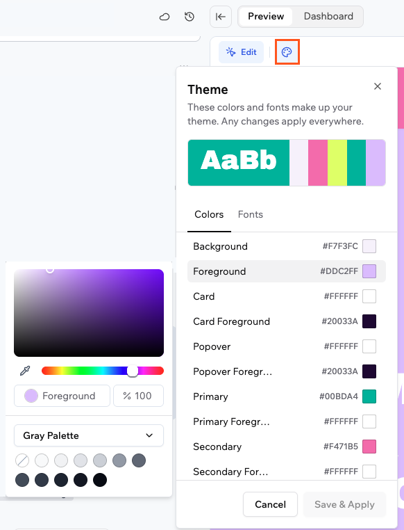
The **Theme** panel lets you set colors and fonts for your entire app from one place. Any change you make applies everywhere instantly, so you do not have to update elements one by one.
The panel shows a preview of your current palette at the top, followed by a list of color roles you can customize, such as background, foreground, primary, secondary, card, and popover. Click **Fonts** at the top of the panel to set your app's font instead.
Select the option you want and click **Submit**, or click **Skip** to let the AI decide.
***
## Global changes
The **Theme** panel lets you set colors and fonts for your entire app from one place. Any change you make applies everywhere instantly, so you do not have to update elements one by one.
The panel shows a preview of your current palette at the top, followed by a list of color roles you can customize, such as background, foreground, primary, secondary, card, and popover. Click **Fonts** at the top of the panel to set your app's font instead.
 ### Theme colors
Click any color role to update it across your entire app.
**To change a color in your theme:**
1. Click the **Theme** icon at the top of your app editor.
2. Click any color role in the list to open the color picker. The bar at the top of the panel is a preview of your current palette and is not clickable.
3. Choose your color by dragging the picker, entering a hex value, using the eyedropper to sample any color on screen, or picking from a palette using the dropdown at the bottom of the picker.
4. Click **Apply** to preview the change in your app.
5. Click **Save & Apply** in the **Theme** panel to apply it everywhere.
Start with your primary color and background, then let those guide your other choices. Keeping foreground and background colors high contrast makes text readable across all components.
If your theme colors do not match your app's current colors, you can ask the AI chat to sync them. For example: `Update my theme to match the colors used in my app`.
### Fonts
Set your app's fonts from the **Fonts** tab in the **Theme** panel. A dropdown appears for each font your app uses.
**To change your app fonts:**
1. Click the **Theme** icon at the top of your app editor.
2. Click the **Fonts** tab.
3. Click a dropdown and select a font. You can search by name or browse **Brand Fonts** and **All Fonts**.
4. Click **Save & Apply** to apply the changes across your app.
### Theme colors
Click any color role to update it across your entire app.
**To change a color in your theme:**
1. Click the **Theme** icon at the top of your app editor.
2. Click any color role in the list to open the color picker. The bar at the top of the panel is a preview of your current palette and is not clickable.
3. Choose your color by dragging the picker, entering a hex value, using the eyedropper to sample any color on screen, or picking from a palette using the dropdown at the bottom of the picker.
4. Click **Apply** to preview the change in your app.
5. Click **Save & Apply** in the **Theme** panel to apply it everywhere.
Start with your primary color and background, then let those guide your other choices. Keeping foreground and background colors high contrast makes text readable across all components.
If your theme colors do not match your app's current colors, you can ask the AI chat to sync them. For example: `Update my theme to match the colors used in my app`.
### Fonts
Set your app's fonts from the **Fonts** tab in the **Theme** panel. A dropdown appears for each font your app uses.
**To change your app fonts:**
1. Click the **Theme** icon at the top of your app editor.
2. Click the **Fonts** tab.
3. Click a dropdown and select a font. You can search by name or browse **Brand Fonts** and **All Fonts**.
4. Click **Save & Apply** to apply the changes across your app.
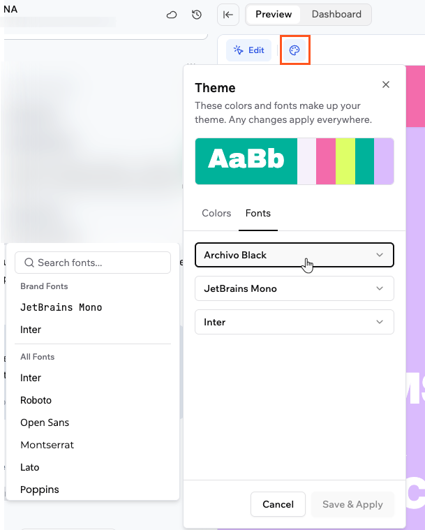 If you don't see a **Fonts** tab, your app may not have theme font variables set up yet. Ask the AI chat to add them: `Add theme font variables to my app so I can change fonts from the Theme panel`.
***
## Element changes
When you are in **Edit** mode, you can style any individual element directly. Select an element and use the icons in the Edit toolbar to change its colors, typography, spacing, corner radius, opacity, or add custom Tailwind classes. The options available in the toolbar change depending on the type of element you select.
### Colors
You can set the background and text color of any element using the colors defined in your theme or a custom color.
If you don't see a **Fonts** tab, your app may not have theme font variables set up yet. Ask the AI chat to add them: `Add theme font variables to my app so I can change fonts from the Theme panel`.
***
## Element changes
When you are in **Edit** mode, you can style any individual element directly. Select an element and use the icons in the Edit toolbar to change its colors, typography, spacing, corner radius, opacity, or add custom Tailwind classes. The options available in the toolbar change depending on the type of element you select.
### Colors
You can set the background and text color of any element using the colors defined in your theme or a custom color.
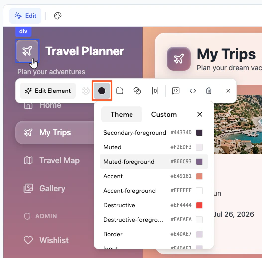 **To change the color of an element:**
1. Click **Edit** at the top of the editor.
2. Select the element you want to change.
3. Click the **Colors** icon in the Edit toolbar.
4. Select the part you want to change, such as background or text.
5. Choose your color:
* **Theme:** pick from the color roles defined in your theme, such as background, foreground, card, and primary.
* **Custom:** drag the picker, enter a hex value, use the eyedropper to sample any color on screen, or pick from a palette using the dropdown at the bottom of the picker.
6. Click **Apply** to confirm the change.
For image elements, the toolbar shows a **Replace** button instead of the Colors option. Click **Replace** to swap the image.
### Typography
When you select a text element, the Edit toolbar shows controls for font family and size. A separate **Text Style** panel gives access to alignment, case, and decoration.
**To edit text content:**
1. Click **Edit** at the top of the editor.
2. Select the text element.
3. Click the **T** icon in the Edit toolbar.
4. Type your changes in the **Text Content** field.
**To change the color of an element:**
1. Click **Edit** at the top of the editor.
2. Select the element you want to change.
3. Click the **Colors** icon in the Edit toolbar.
4. Select the part you want to change, such as background or text.
5. Choose your color:
* **Theme:** pick from the color roles defined in your theme, such as background, foreground, card, and primary.
* **Custom:** drag the picker, enter a hex value, use the eyedropper to sample any color on screen, or pick from a palette using the dropdown at the bottom of the picker.
6. Click **Apply** to confirm the change.
For image elements, the toolbar shows a **Replace** button instead of the Colors option. Click **Replace** to swap the image.
### Typography
When you select a text element, the Edit toolbar shows controls for font family and size. A separate **Text Style** panel gives access to alignment, case, and decoration.
**To edit text content:**
1. Click **Edit** at the top of the editor.
2. Select the text element.
3. Click the **T** icon in the Edit toolbar.
4. Type your changes in the **Text Content** field.
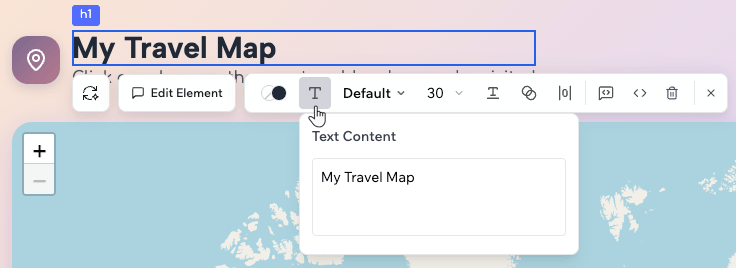 If the text content is dynamically generated, the Text Content panel shows a message that it cannot be edited directly. Use the AI chat to change dynamic text.
**To change the font:**
1. Click **Edit** at the top of the editor.
2. Select the text element.
3. Click the font family dropdown in the Edit toolbar.
4. Search or browse fonts and click one to apply it. Hover over a font with a **>** arrow to see available weights, then click a weight to apply it.
To use a custom font, click **Upload Fonts** at the bottom of the dropdown. You can upload TTF, OTF, WOFF, or WOFF2 files up to 5 MB. Uploaded fonts appear under **Custom Fonts** in the filter.
If the text content is dynamically generated, the Text Content panel shows a message that it cannot be edited directly. Use the AI chat to change dynamic text.
**To change the font:**
1. Click **Edit** at the top of the editor.
2. Select the text element.
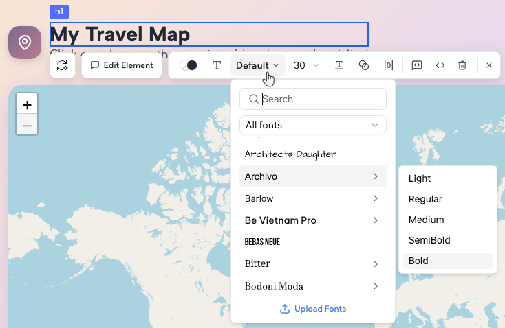
3. Click the font family dropdown in the Edit toolbar.
4. Search or browse fonts and click one to apply it. Hover over a font with a **>** arrow to see available weights, then click a weight to apply it.
To use a custom font, click **Upload Fonts** at the bottom of the dropdown. You can upload TTF, OTF, WOFF, or WOFF2 files up to 5 MB. Uploaded fonts appear under **Custom Fonts** in the filter.
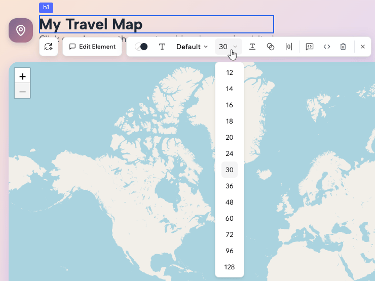
 **To change the font size:**
1. Click **Edit** at the top of the editor.
2. Select the text element.
3. Click the size dropdown in the Edit toolbar.
4. Choose a size. Available sizes range from 12 to 128.
**To change the font size:**
1. Click **Edit** at the top of the editor.
2. Select the text element.
3. Click the size dropdown in the Edit toolbar.
4. Choose a size. Available sizes range from 12 to 128.
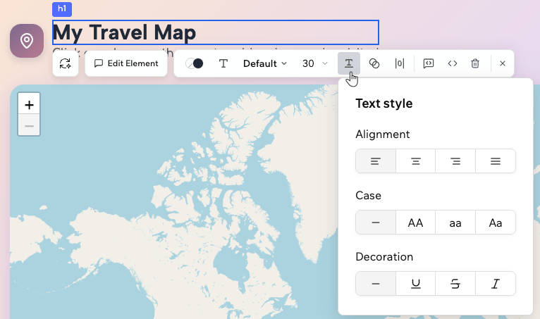
 **To change text style:**
1. Click **Edit** at the top of the editor.
2. Select the text element.
3. Click the **Text Style** icon in the Edit toolbar.
4. Adjust the settings you want to change:
* **Alignment:** left, center, right, or justify.
* **Case:** none, uppercase, lowercase, or capitalize.
* **Decoration:** none, underline, strikethrough, or italic.
**To change text style:**
1. Click **Edit** at the top of the editor.
2. Select the text element.
3. Click the **Text Style** icon in the Edit toolbar.
4. Adjust the settings you want to change:
* **Alignment:** left, center, right, or justify.
* **Case:** none, uppercase, lowercase, or capitalize.
* **Decoration:** none, underline, strikethrough, or italic.
 ### Spacing
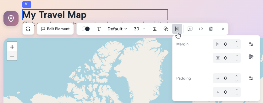
You can set the margin and padding for any element in px, controlling each side independently.
**To change the spacing of an element:**
1. Click **Edit** at the top of the editor.
2. Select the element you want to change.
3. Click the **Spacing** icon in the Edit toolbar.
4. Enter values in px for margin and padding. Use the horizontal and vertical shorthand controls to set both sides at once.
### Spacing
You can set the margin and padding for any element in px, controlling each side independently.
**To change the spacing of an element:**
1. Click **Edit** at the top of the editor.
2. Select the element you want to change.
3. Click the **Spacing** icon in the Edit toolbar.
4. Enter values in px for margin and padding. Use the horizontal and vertical shorthand controls to set both sides at once.
 ### Corner radius
You can round the corners of any element by entering a value in px.
**To change the corner radius of an element:**
1. Click **Edit** at the top of the editor.
2. Select the element you want to change.
3. Click the **Corners** icon in the Edit toolbar.
4. Enter a value in px or use the arrows to adjust it.
### Opacity
You can make any element fully opaque, semi-transparent, or anywhere in between.
**To change the opacity of an element:**
1. Click **Edit** at the top of the editor.
2. Select the element you want to change.
3. Click the **Opacity** icon in the Edit toolbar.
4. Drag the slider or enter a value from 0 (fully transparent) to 100 (fully opaque).
### Tailwind classes
For styling not covered by the other options, you can enter any Tailwind CSS class directly.
**To add Tailwind classes to an element:**
1. Click **Edit** at the top of the editor.
2. Select the element you want to change.
3. Click the **Tailwind Classes** icon in the Edit toolbar.
4. Type any Tailwind CSS class. For example, `shadow-lg` adds a large shadow and `border border-gray-200` adds a subtle border.
***
## Themes and modes
Visual direction is the overall tone of your app. Themes are ways to express that tone using depth, color, and effects. In Base44, you can lean into a theme and still keep your brand intact.
### Design themes
### Corner radius
You can round the corners of any element by entering a value in px.
**To change the corner radius of an element:**
1. Click **Edit** at the top of the editor.
2. Select the element you want to change.
3. Click the **Corners** icon in the Edit toolbar.
4. Enter a value in px or use the arrows to adjust it.
### Opacity
You can make any element fully opaque, semi-transparent, or anywhere in between.
**To change the opacity of an element:**
1. Click **Edit** at the top of the editor.
2. Select the element you want to change.
3. Click the **Opacity** icon in the Edit toolbar.
4. Drag the slider or enter a value from 0 (fully transparent) to 100 (fully opaque).
### Tailwind classes
For styling not covered by the other options, you can enter any Tailwind CSS class directly.
**To add Tailwind classes to an element:**
1. Click **Edit** at the top of the editor.
2. Select the element you want to change.
3. Click the **Tailwind Classes** icon in the Edit toolbar.
4. Type any Tailwind CSS class. For example, `shadow-lg` adds a large shadow and `border border-gray-200` adds a subtle border.
***
## Themes and modes
Visual direction is the overall tone of your app. Themes are ways to express that tone using depth, color, and effects. In Base44, you can lean into a theme and still keep your brand intact.
### Design themes
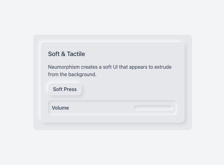 Soft, extruded elements that look pressed into or raised from the background.
Best for calm tools with simple content.
Key features:
* Subtle inner and outer shadows
* Soft, monochromatic palettes
* Minimal depth and clean shapes
Prompt idea:
```text theme={null}
Give this app a soft neumorphic touch:
- Keep the current color palette
- Add subtle shadows to cards and primary buttons
- Avoid heavy contrast backgrounds
- Keep text contrast high for readability
```
Soft, extruded elements that look pressed into or raised from the background.
Best for calm tools with simple content.
Key features:
* Subtle inner and outer shadows
* Soft, monochromatic palettes
* Minimal depth and clean shapes
Prompt idea:
```text theme={null}
Give this app a soft neumorphic touch:
- Keep the current color palette
- Add subtle shadows to cards and primary buttons
- Avoid heavy contrast backgrounds
- Keep text contrast high for readability
```
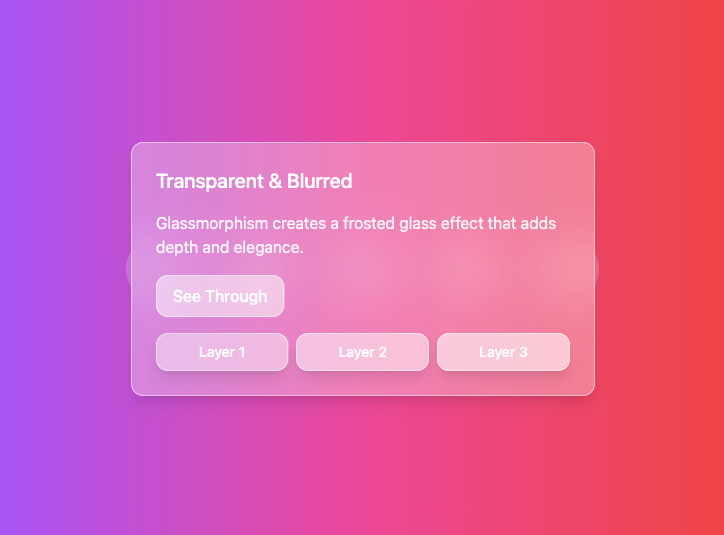 Frosted glass surfaces with transparency and blur effects.
Best for overlays, side panels, and selected cards.
Key features:
* Backdrop blur
* Transparent panels with subtle borders
* Light glow and reflection effects
Prompt idea:
```text theme={null}
Apply a subtle glass effect to overlays and side panels only:
- Use translucent surfaces with blur and a thin border
- Keep backgrounds simple so text remains readable
- Maintain strong text contrast on glass surfaces
Do not apply glass effects to all cards or main content.
```
Frosted glass surfaces with transparency and blur effects.
Best for overlays, side panels, and selected cards.
Key features:
* Backdrop blur
* Transparent panels with subtle borders
* Light glow and reflection effects
Prompt idea:
```text theme={null}
Apply a subtle glass effect to overlays and side panels only:
- Use translucent surfaces with blur and a thin border
- Keep backgrounds simple so text remains readable
- Maintain strong text contrast on glass surfaces
Do not apply glass effects to all cards or main content.
```
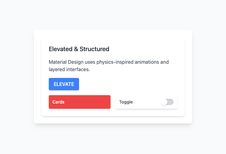 Structured, grid based layout with clear elevation and bold color.
Best for dashboards, admin tools, and data heavy apps.
Key features:
* Clear elevation layers
* Clean grids and alignment
* Purposeful motion
Prompt idea:
```text theme={null}
Move this app toward a soft material style:
- Use clear card elevation for key sections
- Clean up alignment and grids so content lines up
- Use bold, flat colors rather than strong gradients
- Keep transitions subtle and purposeful
```
Structured, grid based layout with clear elevation and bold color.
Best for dashboards, admin tools, and data heavy apps.
Key features:
* Clear elevation layers
* Clean grids and alignment
* Purposeful motion
Prompt idea:
```text theme={null}
Move this app toward a soft material style:
- Use clear card elevation for key sections
- Clean up alignment and grids so content lines up
- Use bold, flat colors rather than strong gradients
- Keep transitions subtle and purposeful
```
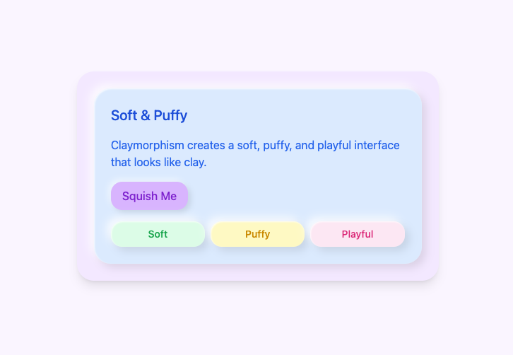 Soft, puffy elements with rounded shapes and gentle shadows.
Best for playful apps, onboarding, or lighter experiences.
Key features:
* Rounded corners
* Pastel or soft color palettes
* Soft, even shadows
Prompt idea:
```text theme={null}
Add a light clay feel to key components:
- Round the corners of cards and primary buttons more
- Use softer shadows under those components
- Keep backgrounds neutral so the app remains readable
Apply this style only to interactive elements, not long text sections.
```
Soft, puffy elements with rounded shapes and gentle shadows.
Best for playful apps, onboarding, or lighter experiences.
Key features:
* Rounded corners
* Pastel or soft color palettes
* Soft, even shadows
Prompt idea:
```text theme={null}
Add a light clay feel to key components:
- Round the corners of cards and primary buttons more
- Use softer shadows under those components
- Keep backgrounds neutral so the app remains readable
Apply this style only to interactive elements, not long text sections.
```
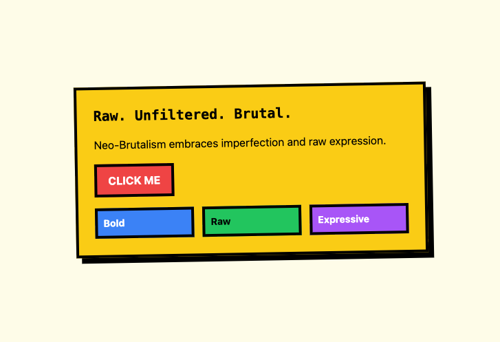 Deliberately bold, with strong color blocks and thick borders.
Best for landing pages and internal tools where personality matters more than subtlety.
Key features:
* High contrast color combinations
* Thick borders and strong shapes
* Raw typography and simple grids
Prompt idea:
```text theme={null}
Apply a controlled neo brutalist feel to the marketing pages:
- Use one bold accent color, one dark, and one light neutral
- Add thick borders and clear sections
- Make headings large and confident
- Keep body text highly readable
Do not apply this style to data tables or dense forms.
```
### Light and dark themes
Light and dark themes let people choose what feels best and can help in different environments.
You can ask the AI chat to add theme support and a toggle.
Deliberately bold, with strong color blocks and thick borders.
Best for landing pages and internal tools where personality matters more than subtlety.
Key features:
* High contrast color combinations
* Thick borders and strong shapes
* Raw typography and simple grids
Prompt idea:
```text theme={null}
Apply a controlled neo brutalist feel to the marketing pages:
- Use one bold accent color, one dark, and one light neutral
- Add thick borders and clear sections
- Make headings large and confident
- Keep body text highly readable
Do not apply this style to data tables or dense forms.
```
### Light and dark themes
Light and dark themes let people choose what feels best and can help in different environments.
You can ask the AI chat to add theme support and a toggle.
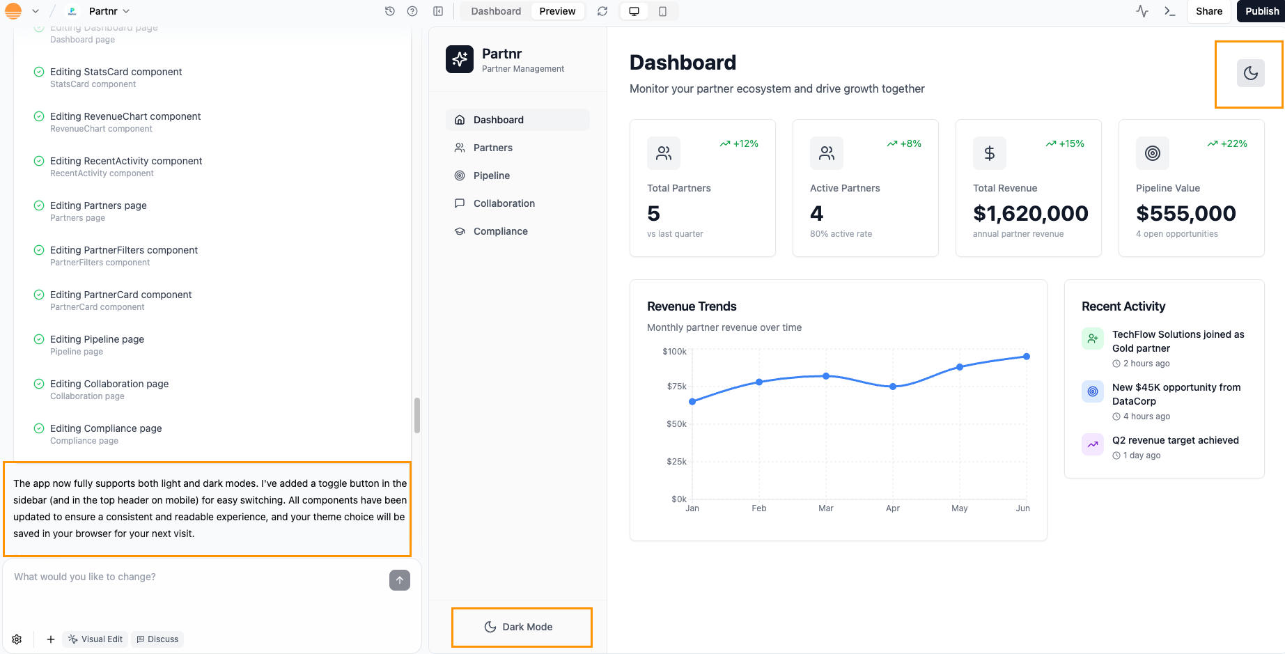
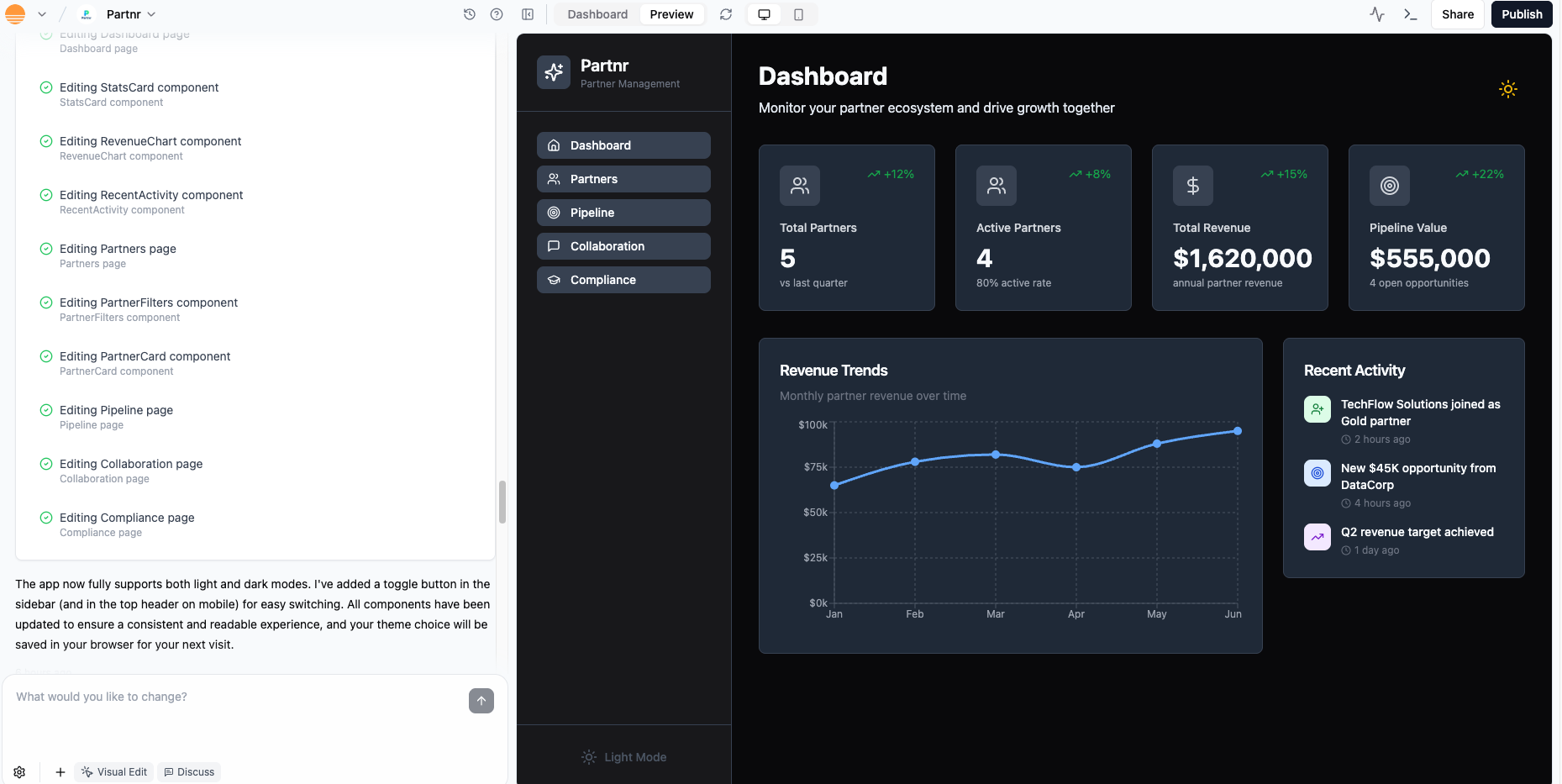 Prompt:
```text theme={null}
Add light and dark mode support:
- Light mode: soft gray backgrounds and dark text
- Dark mode: near black backgrounds, light text, and subtle borders
- Primary and accent colors should remain readable and consistent in both modes
Add a theme toggle in the header and remember the choice per visitor.
```
Theme support touches many components, so it can take AI some time to wire everything up. You can also specify changes that should apply only in light mode or only in dark mode.
***
## Motion and feedback
Motion and feedback help people understand what is happening on screen. You can use them to make clicks feel responsive, show that something is loading, and explain what to do next. In Base44, AI can add these patterns for you, so you do not have to hand code every animation.
Use this section when your app already works, but feels a bit flat or static, and you want it to feel more alive and reassuring.
Micro interactions are small visual reactions to what someone does, for example:
* A button that slightly grows and brightens on hover.
* A card that lifts when you move the mouse over it.
* An icon that gives a small checkmark animation when something is saved.
These effects make the app feel responsive without turning it into a cartoon.
You can ask AI to introduce a consistent set of interactions:
```text theme={null}
Add subtle interactions:
- Fade in each page on load with a short duration
- Make primary buttons gently grow and brighten on hover and focus
- Add a small lift effect to cards on hover
Respect reduced motion preferences and avoid any rapid flashing.
```
For marketing or promo pages, you can use a stronger tone:
```text theme={null}
On marketing pages only:
- Slide hero sections in from the side on first load
- Animate icons when a feature card becomes focused or hovered
- Keep animations short so the page still feels fast
```
Add motion after you are happy with colors, layout, and typography. Motion should support clarity, not hide weak structure.
Loading, empty, and error states are the places where people often feel stuck. Good feedback here can make your app feel much more polished and forgiving.
Examples:
* Loading: skeleton shapes that match the final layout instead of a generic spinner.
* Empty: a friendly message that explains what will appear here and a button to create or connect something.
* Error: a short, human explanation and a clear way to retry or get help.
You can ask AI to create these patterns across the app:
```text theme={null}
Improve feedback states:
- For each main list and dashboard, add a skeleton loader that matches the layout
- Design an empty state with an icon, one line explanation, and a primary action
- Add a clear error state with a short message and a retry button where relevant
Use the existing color and typography system.
```
These changes do not affect your data or logic, they only change how your app communicates to people when something is loading, missing, or has gone wrong.
***
## Quick tricks
If you want fast improvements, these short recipes can help you get a lot of value with a few prompts.
* Introduce a simple color system and apply it globally.
* Define clear text roles and increase line height.
* Add basic card and button components and reuse them.
Prompt:
```text theme={null}
Polish this prototype:
- Create a simple color system and apply it across the app
- Define typography roles for titles, headings, and body text
- Standardize buttons and cards and use them consistently
Keep content and logic the same.
```
* Increase row height slightly and add subtle separators.
* Move actions into a consistent column or menu.
* Add filters in a clear top bar.
* Add loading, empty, and error states.
Prompt:
```text theme={null}
Clean up this table page:
- Increase row height and add subtle row separators
- Move row actions into a consistent column at the end
- Add a simple filter bar above the table
- Add clear loading, empty, and error states
```
* Adjust spacing and hierarchy.
* Update card and button shapes.
* Introduce subtle micro interactions.
Prompt:
```text theme={null}
Give this app a soft visual refresh:
- Keep brand colors the same
- Improve spacing and hierarchy on each page
- Round card and button corners slightly and soften shadows
- Add subtle hover and focus states to primary actions
```
***
## FAQs
Click a question below to learn more about designing your app.
Tailwind CSS is a utility first CSS framework. Instead of writing custom CSS rules, you add small class names directly to your elements to control color, spacing, typography, and layout. Each class name usually maps to a single visual rule, so you can "read" the design from the classes themselves.
Common examples you might see:
* Colors: `bg-blue-500` sets a blue background, `text-white` sets white text.
* Spacing: `p-4` adds padding on all sides, `m-2` adds margin on all sides.
* Typography: `font-bold` makes text bold, `text-lg` sets a larger text size.
* Layout: `flex` creates a flex container, `grid` creates a grid container, `items-center` vertically centers items in a flex or grid row.
When you see Tailwind classes in Base44, you can combine them to describe the full style of an element. For example, `bg-blue-500 text-white p-4 flex items-center` gives you a blue bar with white text, padding, and centered content.
For deeper reference and the full list of utilities, you can check the official Tailwind CSS documentation.
You can use design version control in the AI chat to roll back changes.
* Each AI prompt has a **Revert** option that instantly undoes everything that specific prompt changed in your app.
* The clock icon in the AI chat opens version history. You can choose an earlier saved version of your app and roll back to it in one step.
Learn more about [AI chat modes and version history](/Building-your-app/AI-chat-modes).
You can ask the AI chat to remove the specific element, or click **Edit** in the AI chat and select the element, then click the **Delete** icon .
Prompt:
```text theme={null}
Add light and dark mode support:
- Light mode: soft gray backgrounds and dark text
- Dark mode: near black backgrounds, light text, and subtle borders
- Primary and accent colors should remain readable and consistent in both modes
Add a theme toggle in the header and remember the choice per visitor.
```
Theme support touches many components, so it can take AI some time to wire everything up. You can also specify changes that should apply only in light mode or only in dark mode.
***
## Motion and feedback
Motion and feedback help people understand what is happening on screen. You can use them to make clicks feel responsive, show that something is loading, and explain what to do next. In Base44, AI can add these patterns for you, so you do not have to hand code every animation.
Use this section when your app already works, but feels a bit flat or static, and you want it to feel more alive and reassuring.
Micro interactions are small visual reactions to what someone does, for example:
* A button that slightly grows and brightens on hover.
* A card that lifts when you move the mouse over it.
* An icon that gives a small checkmark animation when something is saved.
These effects make the app feel responsive without turning it into a cartoon.
You can ask AI to introduce a consistent set of interactions:
```text theme={null}
Add subtle interactions:
- Fade in each page on load with a short duration
- Make primary buttons gently grow and brighten on hover and focus
- Add a small lift effect to cards on hover
Respect reduced motion preferences and avoid any rapid flashing.
```
For marketing or promo pages, you can use a stronger tone:
```text theme={null}
On marketing pages only:
- Slide hero sections in from the side on first load
- Animate icons when a feature card becomes focused or hovered
- Keep animations short so the page still feels fast
```
Add motion after you are happy with colors, layout, and typography. Motion should support clarity, not hide weak structure.
Loading, empty, and error states are the places where people often feel stuck. Good feedback here can make your app feel much more polished and forgiving.
Examples:
* Loading: skeleton shapes that match the final layout instead of a generic spinner.
* Empty: a friendly message that explains what will appear here and a button to create or connect something.
* Error: a short, human explanation and a clear way to retry or get help.
You can ask AI to create these patterns across the app:
```text theme={null}
Improve feedback states:
- For each main list and dashboard, add a skeleton loader that matches the layout
- Design an empty state with an icon, one line explanation, and a primary action
- Add a clear error state with a short message and a retry button where relevant
Use the existing color and typography system.
```
These changes do not affect your data or logic, they only change how your app communicates to people when something is loading, missing, or has gone wrong.
***
## Quick tricks
If you want fast improvements, these short recipes can help you get a lot of value with a few prompts.
* Introduce a simple color system and apply it globally.
* Define clear text roles and increase line height.
* Add basic card and button components and reuse them.
Prompt:
```text theme={null}
Polish this prototype:
- Create a simple color system and apply it across the app
- Define typography roles for titles, headings, and body text
- Standardize buttons and cards and use them consistently
Keep content and logic the same.
```
* Increase row height slightly and add subtle separators.
* Move actions into a consistent column or menu.
* Add filters in a clear top bar.
* Add loading, empty, and error states.
Prompt:
```text theme={null}
Clean up this table page:
- Increase row height and add subtle row separators
- Move row actions into a consistent column at the end
- Add a simple filter bar above the table
- Add clear loading, empty, and error states
```
* Adjust spacing and hierarchy.
* Update card and button shapes.
* Introduce subtle micro interactions.
Prompt:
```text theme={null}
Give this app a soft visual refresh:
- Keep brand colors the same
- Improve spacing and hierarchy on each page
- Round card and button corners slightly and soften shadows
- Add subtle hover and focus states to primary actions
```
***
## FAQs
Click a question below to learn more about designing your app.
Tailwind CSS is a utility first CSS framework. Instead of writing custom CSS rules, you add small class names directly to your elements to control color, spacing, typography, and layout. Each class name usually maps to a single visual rule, so you can "read" the design from the classes themselves.
Common examples you might see:
* Colors: `bg-blue-500` sets a blue background, `text-white` sets white text.
* Spacing: `p-4` adds padding on all sides, `m-2` adds margin on all sides.
* Typography: `font-bold` makes text bold, `text-lg` sets a larger text size.
* Layout: `flex` creates a flex container, `grid` creates a grid container, `items-center` vertically centers items in a flex or grid row.
When you see Tailwind classes in Base44, you can combine them to describe the full style of an element. For example, `bg-blue-500 text-white p-4 flex items-center` gives you a blue bar with white text, padding, and centered content.
For deeper reference and the full list of utilities, you can check the official Tailwind CSS documentation.
You can use design version control in the AI chat to roll back changes.
* Each AI prompt has a **Revert** option that instantly undoes everything that specific prompt changed in your app.
* The clock icon in the AI chat opens version history. You can choose an earlier saved version of your app and roll back to it in one step.
Learn more about [AI chat modes and version history](/Building-your-app/AI-chat-modes).
You can ask the AI chat to remove the specific element, or click **Edit** in the AI chat and select the element, then click the **Delete** icon .